How to Create an Effective Pop-Up Message
Tactics to build pop-up messages that actually help website users
The term “pop-up message” seems to reference the early days of the internet where pop-up ads were a constant nuisance. Because these were not personalized, relevant offers based on customer interactions and intent, it was only a matter of time before pop-up blockers became the norm.
Thankfully, the internet and digital marketing tactics have come a long way. Pop-ups may occasionally carry a negative connotation, but smart marketers continue to use them to share important messages and drive action on their websites. When done well, a pop-up message can be an effective way to catch someone’s attention. But proceed with caution — because when done poorly, a pop-up can create a bad experience that annoys visitors and even drives them away.
If you’re ready to build successful pop-up messages that actually help website users, here are a few helpful tactics to get started.
Figure out your goals for the pop-up, and draft a succinct message.
A pop-up message may disrupt a visitor’s experience on your website, so you don’t want to use one without good reason. Think through your goals in advance. Are you hoping to drive newsletter sign-ups? Reduce cart abandonment? Raise awareness for a new product?
Then ask yourself: Is this message ideally suited to a pop-up, or would a different tactic or format work best?
Once you’ve decided that a situation calls for a pop-up, draft a succinct, clear message. Everything you share should be in service of driving visitors to complete the goal you identified. Think through the various elements that will need to be included in the pop-up message. Will you need a short form? A CTA button? What will the CTA button say? This process will help you make decisions later on.
Nail the pop-up message design.
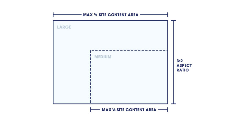
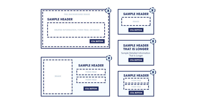
Next, design a few templates using your brand guidelines. As you create your templates, consider including different sizes of images and various lengths of copy. This will provide you with a more extensive library of pop-up message types to pull from in the future.
Here are a few examples:
Leverage relevant, personalized content.
One of the best ways you can minimize the disruption of a pop-up is to deliver a message that’s relevant to your visitors — one they won’t mind being interrupted for. This means tailoring the content of your pop-up to each person, either by including relevant information or removing the pop-up completely if the CTA is irrelevant to the individual.
For example, you could use a pop-up message to:
You can use rules or algorithms to accomplish this type of personalization. With rules, you manually select a message, product, or content asset to display to anyone that meets predetermined criteria. For example, if you wanted to use a pop-up to encourage visitors to sign up for your loyalty program, you would set a rule to show the message only to visitors who aren’t already members.
Machine-learning algorithms can sift through all the information you have about a person to pick the most relevant experience for them. For example, if you wanted to feature a content asset or product they are most likely to engage with, an algorithm can make the most fitting decision in real time based on their interests and preferences.
When you use information about each person (either known or anonymous), you can ensure that every visitor interacts with a pop-up message relevant to them.
Decide on placement.
Once your pop-up is ready to go, think about where your message should appear on the page. To do this effectively, think back to your goals.
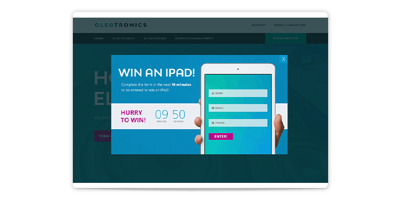
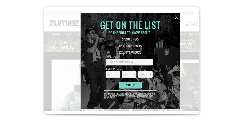
Do you want to completely restrict a visitor’s access to the rest of your site and focus all of their attention on the pop-up? If so, you’ll want to center the pop-up and even gray out the rest of the page with a lightbox effect.
Zumiez did just that to focus people’s attention on its pop-up message to drive sign-ups to its loyalty program.
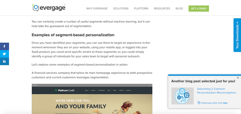
On the other hand, if you don’t want to take over the entire page, you could consider displaying the pop-up in a corner of the screen.
For example, maybe a pop-up slides into the bottom right-hand corner to recommend blog posts. The slide-in message seen below suggests the most recent blog post in the category the user has spent the most time viewing, but it’s also one that they haven’t already read. Note that this one is much smaller than the Zumiez pop-up, as we don’t want to stop the visitor from reading the article behind it. We just want to encourage them to continue reading related articles.
Pick the right moment.
Finally, you need to consider timing. The moment your message appears will have a huge impact on how well (or how poorly) the message is received. Many websites deliver a pop-up message the second a visitor lands on the site. That may be effective at catching attention, but does it really provide a good experience?
When it comes to pop-up message timing, there is no easy answer. Your timing should depend on what you’re promoting or what action you’re trying to drive. For example, it likely doesn’t make sense to ask visitors if they want a demo of your product right when they land on your website. They’ll likely be more receptive after they have read through a few pages first.
You can choose to serve pop-up messages based on a number of different criteria, including:
Final thoughts
A pop-up message is just one type of experience you can serve to your website visitors. There are many different ways to communicate across a website with both generic and personalized experiences. And while pop-ups can certainly be effective, they should not be overused. Consider whether your message truly calls for a pop-up or if another type of interaction may provide a better user experience.
To learn more about how Marketing Cloud Personalization can help you deliver custom content in your pop-up messages and through many other experiences across channels, request a demo today.

Product
Marketing Cloud Personalization

Report
The Gartner Magic Quadrant for Personalization Engines, 2020