

There’s a reason marketers don’t wrap up their content by writing ‘the end’. If you don’t encourage your audience to take the next step, they won’t. To turn attention into action and get customers in the mood to buy, you need a clear prompt that tells a lead what to do next.
This is exactly what a call to action (CTA) does. It’s a value-driven statement that tells your audience the next step you want them to take. This guide will explore why CTAs matter, touch on some CTA examples and explain how to create one that pushes customers closer to the point of sale.
What you’ll learn:
- What is a CTA?
- Types of CTAs (with examples)
- Common CTA formats (and why they work)
- How to write a call to action that converts
- Where should you place your CTA?
- The importance of A/B testing CTAs
- How AI can level up your CTA
- Putting what you’ve learned to the test
What is a call to action (CTA)?
A call to action (CTA) is a prompt that encourages your audience to take the next step, whether that’s starting a free trial, booking a demo, speaking to sales or downloading an eBook. It’s usually a short phrase, such as ‘Get started’ or ‘Talk to an expert’, that’s paired with a button or link.
CTAs are essential for marketers because they push customers to take action. You might have the best campaign in the world, but if you don’t telegraph a clear next step, customers are more likely to hesitate and drop off. This leads to lost opportunities for sales.
The best CTAs reduce friction and guide customers through your sales funnel. This means they can have a significant impact on your conversion rates and overall sales, especially when you can personalise your CTAs to align with buyer needs.
Turn insight into action with smarter CTAs
Learn how Salesforce helps you personalise next steps, remove friction, and increase conversions across every touchpoint.


Types of CTAs (with examples)
Not every CTA does the same job. Some are designed to generate leads, others to close a sale and others to encourage engagement. Understanding how CTAs differ will help you with formatting, wording, and even deciding where to place the CTA on the page. Let’s sum up the types with a table.
CTA Types and Examples
| CTA type | Description | Example |
|---|---|---|
| Lead generation | Encouraging users to share details (like email or phone), often in return for access to gated content, newsletters or demos | ‘Get the latest retail industry insights and trends’ ‘Download the free eBook’ ‘Sign up to the newsletter’ |
| Social sharing | Prompting users to share your content with their networks to increase reach and awareness | ‘Share this post’ Share on Facebook’ ‘Tag a friend’ |
| Sales conversion | Driving users to make a purchase, upgrade to a new service or start a paid plan | ‘Buy now’ ‘Add to cart’ ‘Upgrade today to unlock this feature’ |
| Event promotion | Asking readers to register interest or sign up for a webinar, conference or live event | ‘Register now’ ‘Secure your seat today’ ‘Add to calendar’ |
| Lead nurturing | Moving prospects closer to a decision with educational content or product-focused CTA copy | ‘Read the full guide’ ‘Watch the demo’ ‘Learn more’ |
| Account actions | Getting existing users to sign up, log in or complete other account-related tasks | ‘Create an account’ ‘Manage your subscription’ ‘Update your preferences’ |
| App downloads | Driving users to get an app on mobile or desktop or to update the app they already have | ‘Download the app’ ‘Get it on the App Store’ ‘Update now’ |
| Community | Encouraging users to connect with your brand’s community or follow your social media channels | ‘Join the community’ ‘Get connected’ ‘Follow us on Instagram’ |
Understanding these types of CTA will influence the verbs you use to drive action, as well as how you present your CTA to the user. It also plays a big role in CTA formatting.
Common CTA formats (and why they work)
CTAs can appear as buttons, links, forms, pop-ups and more; each has its own strengths, depending on your goal.
Choosing the right CTA format is just as important as the words you use because, along with CTA positioning, it determines whether the next step feels frictionless or like an interruption. Let’s take a look at the different options.
Buttons
A CTA button is the most common call to action format. Buttons stand out from the page and make the next step obvious. As they’ve been shown to increase clicks by 45%, they’re particularly useful for high-intent actions like ‘Buy now’ or ‘Start a free trial’. Here’s an example of a call-to-action button:

Here are some tips to get the most out of your button CTAs:
- Use clear copy that drives action (‘Talk to sales’, ‘Get started’)
- Add contrast by colouring your button so it stands out on the page
- Place buttons above the fold, then repeat at natural decision points (after benefits, for example)
There’s a lot of room for creativity with a button CTA. Choose colours that stand out, and don’t be afraid to be creative with your wording. For instance, if signing up to your service will help the customer cut costs, maybe your CTA could be ‘Show me the money’ or ‘Start saving’.
Forms
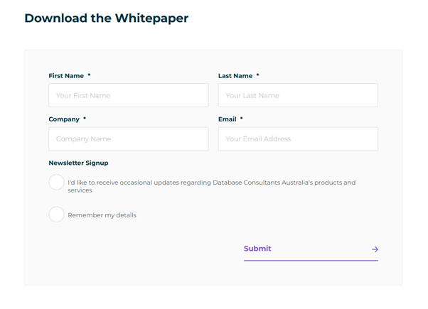
Forms help you generate leads by capturing information like name, email, company, phone or role. They’re often paired with lead generation CTAs like ‘Download the full report‘, which requires the reader to enter their details to receive the document via email.
Keep these best practices for this kind of CTA in mind:
- Ask only for info that’s truly important (contact details) to reduce drop-off
- Make the value exchange obvious (receiving a full guide, unlocking an offer, etc.)
- Keep fields that your lead needs to fill out clean and simple to reduce friction
As a rule of thumb, the fewer clicks and keystrokes required in your form, the more likely someone is to complete it.
Contextual links
Contextual links are CTAs embedded directly into body copy, such as ‘Learn more about this customer story’, or ‘See the full product tour’. They work better for low-friction actions, where you want to give users the opportunity to find out more without ruining the flow of an article.

The best place to use contextual links is within blogs and long-form content. They can also work effectively in help centres and email nurture sequences. Essentially, use them for any CTA that’s trying to educate and nurture rather than encourage a sale directly.
Pro tip: Be sure to embed CTA links naturally into the text. Have your URL connected to active keywords that others might be typing into a search engine, for example.
Pop-ups
Pop-ups are highly visible, interruptive CTAs that ‘pop up’ on top of the main content. These CTAs can be triggered by things like how long a user spends on a page, how deeply they scroll or when they indicate that they intend to leave the site.
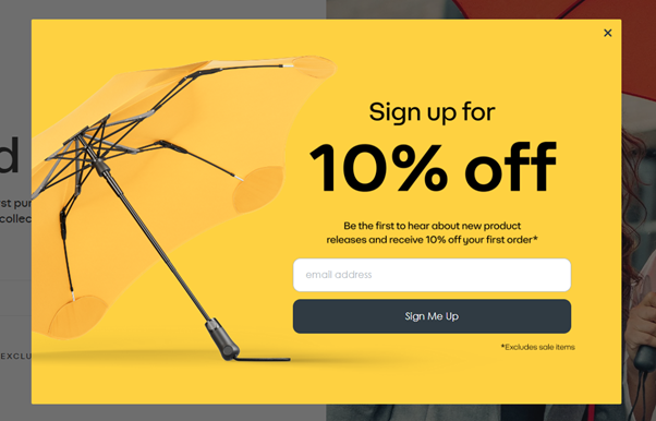
Pop-ups have some of the highest conversion rates of any CTA type, averaging around 12%. They’re particularly useful when displaying things like limited-time offers or sales promotions that encourage users to act with urgency. That said, they need to be used carefully because they interrupt the reader, which can cause frustration, especially if the pop-up is hard to remove.
Banners
Banners usually appear at the top or bottom of the page within an app or on a landing page. They’re great for persistent, lightweight CTAs that promote simple next steps, such as ‘Register for our webinar’ or ‘Explore new features’. You’ll usually find them paired with button CTAs.
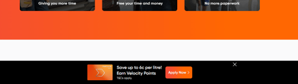
As with pop-ups, banners are a great way to highlight time-sensitive campaigns or product announcements. And while they may not be as attention-grabbing as a pop-up, they’re much less intrusive, meaning they often sit better with customers.
Verbal CTAs
As digital marketing content becomes more dynamic and multimedia in nature, you might need to have someone say your CTA out loud.
In a video explainer of your product, for instance, a voice-over could explain the next steps to learn more or make a purchase. On a podcast, the host might give a CTA to become a subscriber or to visit the brand’s website to get more resources about an episode’s topic.
Of course, you can have verbal CTAs that mention URLs, too. Just make sure they’re short enough that they’ll be easy for someone to remember and look up later.
How to write a call to action that converts
There are three keys to writing a successful CTA: wording, design and a strong understanding of what your customer is looking for. Whether you want to drive more demo bookings, sign-ups or direct sales, here are 10 tips to get each element perfect.
1. Be clear and direct
You don’t want to make your audience decode the meaning behind your CTA. Avoid vague labels like ‘Book’ or ‘Download’. Instead, clearly spell out the next step with ‘Book a demo’ or ‘Download the full report’. CTAs like these reduce uncertainty, and that reduces friction. If you feel there’s a risk of confusion, err on the side of being literal rather than too clever.
2. Use action verbs
Your CTA needs to encourage action. Start with a strong, active verb that signals what the user will do, such as ‘get’, ‘join’, ‘try’, ‘buy’ or ‘download’. This shifts the focus from the current page to the outcome when they click the link.
3. Create value
To amplify your active verbs, pair them with a clear benefit. For instance, instead of using ‘Download’ or ‘Buy’, say, ‘Download the full playbook’ or ‘Buy now for 50% off’. This approach provides concrete value that will encourage your reader to take action.
4. Keep it short and skimmable
Most users scan articles rather than read every word. Aim for concise CTAs (around two to six words) that your customers can read at a glance. If extra information is essential, place supporting content above or below the button or link, rather than within the CTA itself.
5. Create a sense of urgency (where appropriate)
Adding urgency to your CTAs can help your audience decide to take action immediately rather than later. Try phrases like ‘Book now while spaces last’ or ‘Register before Friday’ to encourage quick action. That said, you need to be honest here. Faking scarcity can erode trust and drive customers away.
6. Use strong visual design
CTAs need to be easy to find. Use colour, size and white space to ensure your buttons or links stand out. A strong primary colour that contrasts with the background of your page is a good place to start, though it’s important to make sure this doesn’t clash with your branding.
7. Use supporting copy to remove friction
Sometimes the words around your CTA can have the biggest impact. Short lines like ‘Takes less than 2 minutes’, ‘no credit card required’ or ‘cancel anytime’ can eliminate any remaining concerns your audience may be feeling, encouraging a click.
8. Optimise for mobile
Your CTA could look amazing on desktop but be impossible to tap on mobile. Make sure you make your mobile buttons large enough for thumbs, with enough spacing around them to prevent mis-taps. Check your CTAs on every device to ensure they’re effective.
9. Personalise your CTAs to match user intent
Personalised CTAs can increase click-throughs by more than 200%. One of the most powerful ways to achieve this personalisation is to tailor your CTAs to your customer’s stage in the sales funnel. For instance:
- Top-of-the-funnel leads (awareness) who are learning about your brand may respond better to ‘Learn more’ or ‘Download the guide’ so they can find out more.
- Middle-of-the-funnel leads (interest, consideration) are deciding whether your brand is right for them. Try ‘Watch the demo’ or ‘Compare plans’ to help them evaluate your solution.
- Bottom-of-the-funnel leads (negotiation, decision) are almost ready to buy. Aim for effective CTAs like ‘Start free trial’ or ‘Talk with sales’.
Solutions like Agentforce Marketing can help you build personalised journeys and attribute different CTAs to every stage of your customers’ lifecycles. This ensures you can serve the right next step to the right person without manually updating every marketing campaign.
See the top trends in data, AI, and more — from nearly 5,000 marketers worldwide.
Where should you place your CTA?
Where you place your CTAs is just as important as what they say. Positioning determines how easy it is to find your CTA and whether it feels like a natural next step or an interruption. Here are some tips to get your placement correct for different content styles.
Landing pages
On landing pages, your primary goal is almost always to drive a conversion, so your website CTAs need to be impossible to miss. Placing one above the fold means a user can see your prompt straight away before they start scrolling, even if they’re only skimming the page. Here’s an example:
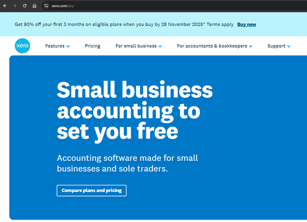
You’ll notice this website CTA is bottom-of-the-funnel oriented, ideal for a landing page where your main objective is to drive sales. You can then pair this with supporting CTAs further down the page after you’ve introduced benefits and social proof, as well as at the end of the page.
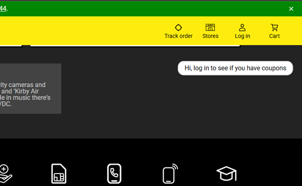
In addition, sidebars and sticky banners are ideal for lightweight messaging that supplements your main CTA. For example, this sidebar CTA from JB Hi-Fi encourages users to sign in to check for coupons. It’s simple, effective and non-invasive.
Blogs
Users come to blogs for information rather than to buy something outright. That’s why it’s best to avoid using in-text CTAs that detract from the value of your content. Instead, save your primary CTA for the end of the blog once the reader is ready to take the next logical step.
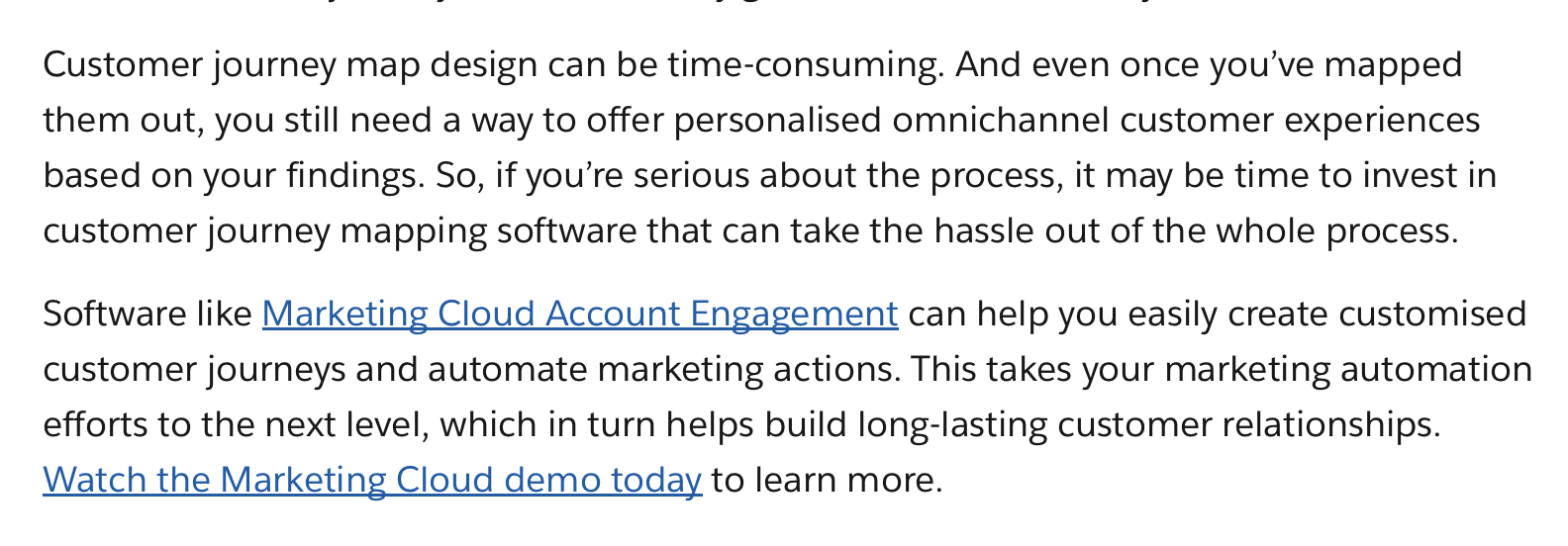
The key here is to ensure your CTA builds upon the topic you’ve talked about in your blog. Here’s an example from Salesforce to show how the topic of an article can naturally segue into a powerful CTA.
You can also include internal links throughout your content to guide readers to related resources. Again, sidebars and sticky banners also work particularly well for blogs, as they’re lightweight and won’t disrupt the reader.
Emails
CTAs in emails should act as a bridge between your main topic or header and the next touchpoint (a landing page or product announcement, for instance).
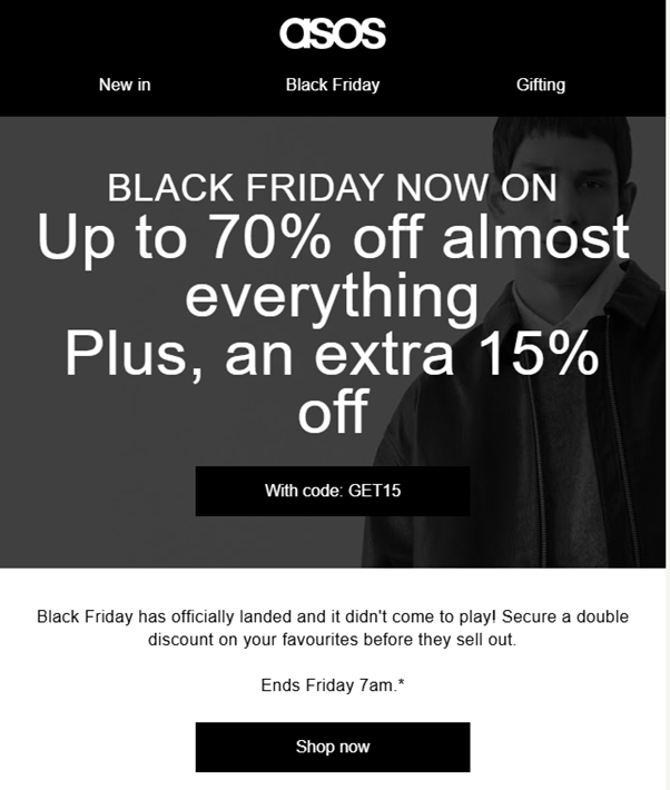
As with blogs, CTAs here shouldn’t detract from the value of the email. However, they do provide more room for creativity. Here’s how ASOS uses urgency, bold text, imagery and a call to action button with clear value to encourage users to shop during the Black Friday sale.
Checkout and transactional pages
On checkout pages, your goal is to keep things simple to minimise opportunities for friction. This is the moment for a single, unambiguous primary CTA, with any other actions deprioritised.
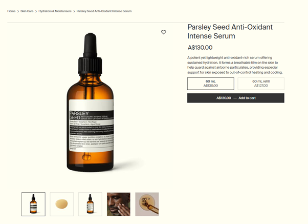
For instance, you’ll notice how Aesop’s product page has lots of white space to make the ‘Add to cart’ button impossible to miss.
Social media posts
Social media marketing is highly competitive, and most users scroll quickly to the next piece of content. This means your CTA needs to be short, benefit-led, colourful and easy to see.
As one example, this Facebook ad from Healf immediately leads with the benefit users can expect in large, bold letters with a striking image to grab attention. Customers then simply need to tap the image to be taken directly to the product page.

The importance of A/B testing CTAs
Even the best CTAs are educated guesses until you test them with your target audience.
A/B testing lets you compare two (or more) CTA variations side by side, altering one element at a time so you can see which changes are having the biggest impact. Over time, these small tweaks can compound into a measurable increase in conversions and ROI.
Which CTA elements should you test?
First off, let’s start with which elements you should be A/B testing:
- Buttons: Different designs draw the eye in different ways. Try contrasting colours, text styles and effects to see which combination captures attention the best.
- Wording: Try variations of different verbs (‘Get started’ vs. ‘Sign up’) and value propositions (‘Download the full report here’ vs. ‘Get the report for free’).
- Urgency: Include urgency in your CTA to see if it has a noticeable impact on conversions. For instance, instead of ‘Buy here’, opt for ‘Buy now’.
- Placement: Switch up the placement of your CTAs. Try above the fold, at the end, in sticky banners and in sidebars. Experiment with different combos to measure impact.
- Length: Compare punchy CTAs with longer, more benefit-oriented ones, like ‘Join now’ vs. ‘Join now and save 20%’.
How to measure CTA performance
Once you begin A/B testing your CTAs, you need a way to keep tabs on performance. Here are the four key metrics you need to assess to measure success:
- Click-through rate (CTR): First off, how many people are clicking your CTA out of those who saw it? This is a clear indicator of how compelling your copy and design are.
- Conversion rate: How many clickers complete the desired action (like signing up or requesting a demo)? This tells you whether your CTA is getting clicks from the right customers.
- Bounce rate: Do users click the link but then quickly leave the page? This indicates your destination didn’t match customer expectations.
- Engagement rate: Look at broader engagement metrics, such as time on page and pages per session, to see if your CTA and overall content are encouraging deeper interaction.
Agenforce Marketing, paired with Tableau, can help you A/B test different CTA variations, track their performance and visualise the findings in easy-to-understand dashboards so you can spend more time optimising your campaigns.
How AI can level up your CTA
Marketing AI transforms CTAs from static best guesses into dynamic prompts that adapt to each customer. Rather than manually tweaking each button or banner, the right AI solution can help marketers generate CTA prompts at scale, personalise them and optimise them with data.
At a basic level, content generation tools can write compelling call-to-action copy based on short prompts. However, there are several advanced artificial intelligence use cases that can unlock even more potential. Here are three to consider:
- Personalisation: AI can tailor CTAs based on behaviour, page performance or your audience’s stage in the lifecycle. This is big news for businesses, especially as personalised CTAs have been shown to generate 202% more clicks.
- Optimisation: By analysing A/B test results, AI can spot patterns across campaigns that you might miss and recommend the next best placement, variant or message to help you improve conversions.
- Automation: Instead of manually editing every asset yourself, AI can generate CTAs automatically and update them across emails, landing pages and ads without you having to move a thing yourself.
AI agents can take these benefits a step further by recommending next steps to users in real time. For instance, if a user expresses interest in a financing option, a conversational AI agent could respond with ‘You’re eligible for our growth plan – want to get started now?’
Agentforce brings all of these possibilities together in one place, giving marketers everything they need to automate routine tasks, optimise CTAs and personalise every experience for your customers across your campaigns.
How can your business use AI?
Get inspired by these out-of-the-box and customised AI use cases, powered by Salesforce.
Putting what you’ve learned to the test
If you lead with value, position your CTAs correctly, use design elements to your advantage and ensure your wording resonates with customers, you’ll put your business in a positive position to engage, nurture and convert consistently.
That said, while prompts made from scratch are a powerful way to build strong messages, the real value comes when you can pair your CTAs with AI to personalise and scale them across every channel. Agentforce can help you identify intent, build value-led CTAs and surface the right CTA at the right time to guide customers to the point of sale and beyond.
Ready to start putting AI to work for your content marketing campaigns? Try Salesforce free for 30 days to see what’s possible.
FAQs
How many CTAs should I use on a single page?
That depends. In general, focus on one primary CTA and then, if needed, include some secondary, supporting CTAs. The important thing is to avoid competing messages, as this can confuse the user. Make sure your primary CTA stands out and contains the main goal of the page, whether that’s driving a sale or encouraging a sign-up.
What’s the difference between a primary CTA and a secondary CTA?
A primary CTA is the main action you want users to take, like buying a product or joining a newsletter. Secondary CTAs offer lower commitment steps, like helping the user learn more or download a free guide. These CTAs are best for users who are further up the funnel and aren’t ready to take the next action yet.
What happens if my CTAs are getting clicks but aren’t converting?
This likely indicates a problem with the destination of the CTA. For instance, if your CTA says, ‘try it for free’, but the link directs to a pricing page, they’re likely to abandon it immediately. Check that the landing page delivers on what it promises to ensure it guides them to the next step properly.