


Creating a great analytics experience can be a daunting task. For many, the word “analytics” brings to mind dashboards with dense grids of charts stemming from innumerable spreadsheets — information overload.
But when we think of analytics at Salesforce, we think of apps: dynamic, focused, and actionable. When we create analytics apps for ourselves and our customers, we follow a design thinking approach. Design thinking is an iterative process by which we seek to determine who our users are, understand their needs and goals, how to address their challenges, and ultimately create innovative solutions that make them more successful.
Using a design thinking approach ensures that we create an analytics experience that taps into all the rich insights your data has to offer and presents them in a way that your users can readily view, understand, and take action on.
In this post, we will walk through our guiding principles of design. You’ll learn the iterative, three-step design process that we use to design analytics apps for our users and that you can use when creating your own analytics apps.
Our design guiding principles
Before you begin your design journey, you need to define your guiding principles. What principles will guide you in the process of designing your apps and also serve as a rubric when you evaluate your app with your users?
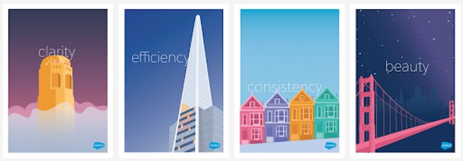
At Salesforce, our guiding principles are clarity, efficiency, consistency, and beauty. We use these principles when discussing our designs and ask ourselves whether our apps fulfill these principles when we review our work. Can users see, understand, and act on our apps with confidence? Have we streamlined and optimized workflows? Are apps familiar and consistent in how they solve problems? Are they aesthetically pleasing?
Our design process for analytics apps

Once you have your design principles, you can follow an iterative, three-step design process to build out your apps.
Empathize
Empathy is the bedrock of good design. To frame your understanding, start gathering information about your user’s intentions, goals, and desired actions. Who is it for? What does success look like for them? One way you can do this is to create a persona to understand your user. You’ll also want to identify the path of inquiry — a structured outline of all the user’s information needs to achieve their goal. Understanding the world from the user’s point of view will guide the entire design process.
Ideate
Once you have an understanding of your users’ needs and goals, collaborate with your team to answer key moments along your users’ path of inquiry. You can bring together all your ideas through design studios. Using non-digital materials (pens, paper, stickies, whiteboards), gather your team to follow a four-step process:
- Sketch: Use multiple rounds of time-boxed sketch sessions for participants to draw ideas.
- Present: Give each participant a chance to present their sketches.
- Discuss: Discuss the ideas presented and sort them into groups.
- Prioritize: Prioritize each sketch based on relevance to answer the user goals and needs.
When you’re done, you’ll have a loosely organized set of ideas for your app.
Design + test
With your ideas in hand, it’s time to start designing your information. You’ll need to decide how to structure your apps. Will you organize by persona? Will you use F, Z, or Side-by-Side Layouts for your information? What charts and colors will you use? There are many factors to take into account and you’ll want to gather user feedback and iterate throughout the whole process to ensure that your app is helping your intended users be as successful as possible.

F, Z, and Side-by-Side page layout
In any project, design can be the hero or the villain. By ensuring that you’ve established your team’s guiding principles at the onset and that you follow an iterative design process, you can create beautiful analytics apps that help your users be more successful.
Interested in learning more? Take a deeper dive into our Defining Principles to Drive Design Decisions and a more in-depth look at our iterative process to Transform Data into Insights.
Or, relive the Best of Dreamforce 2019 with our Einstein Analytics User Experience team as they walk us through Design Thinking for a Better User Experience.