Need Help Picking Design Colors? Here’s How To Do It Right

These 4 principles can guide your brand palette, and improve accessibility and user experience.

Whether you’re building a customer-facing site, designing a marketing email, or developing a product, at some point, you’re going to talk about colors and branding. That may be daunting for some folks, especially non-designers. But it doesn’t have to be. Anyone can learn a few basics to make those conversations less overwhelming and to make the process more objective. In our work developing color guidelines for the Lightning Design System, the designers at Salesforce have created a few guiding principles for picking colors that you can adopt.
What is color theory?
Before we get to the principles, we need a mini lesson on color theory. Basically, color theory provides structure to understanding color and color usage. By rooting color decisions in clear rationale, it minimizes potential opinion conflicts, reduces subjectivity, and, importantly, saves time.


Principles of design colors reduce subjectivity
Within visual design, color conveys emotion, focuses the viewer’s attention, and guides user actions. But, perception is subjective, which means that visual design is subjective, too. The more you can define the how and why behind a decision, the less room there is for interpretation. The principles you create and define are up to you. Here, we share the Lightning Design System color principles we use and why we use them:
Intentionality
The why behind a color decision. Example scenario:
- Question: Why don’t we use red for icons?
- Rationale: We use red to intentionally signal an error. If we use red in other contexts, it would reduce the impact of our error messages.
Hierarchy
The visual structure of a layout and how that navigation guides the user and creates intentional attention. Example scenario:
- Question: Why are our tabs styled with a light blue background? Can we make it brighter?
- Rationale: We can, but in this environment, we want the primary button to stand out more than the tabs so that we minimize cognitive load and disrupt the flow of visual scanning.
Branding
Connects and roots the experience in a familiar and established visual language. Example scenario:
- Question: Why is our button that blue?
- Rationale: That’s our brand color.
Accessibility
Follows Web Content Accessibility Guidelines (WCAG). Example scenario:
- Question: Why don’t we make that color lighter? I think it looks better.
- Rationale: If we were to do that, we wouldn’t be meeting WCAG guidelines, and following those guidelines is required. Looking better isn’t always the most inclusive approach for users.
There are many additional considerations that might affect your conversations around color. Some include scale, brand, and messaging. Knowing the scale of the impact of your color decisions will help you determine the color themes and how they interplay. Work with your brand team (could be internal or an agency) to understand how best to represent the design in the user interface.
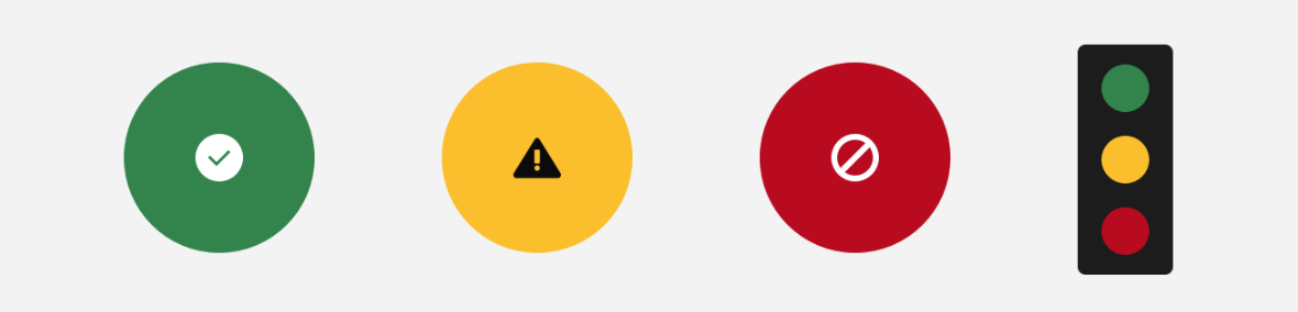
Related, identify what colors will signify messaging patterns like success, warning, error, among other significant states. Make conscious choices about how else these colors might exist – or not – in the visual language. If there are instances where messaging colors overlap with brand, collaborate with the brand team to decide what color(s) to use.
4 color theory design principles to follow
Salesforce has an easy-to-use, yet sophisticated color system that helps designers find consistency, continuity, and meaning with their color selections. The Salesforce color system within the Lightning Design System also simplifies meeting color contrast accessibility requirements in an intuitive way. These principles extend from our work to develop a color system.
1. Color choices are intentional
Color conveys both conscious and unconscious meaning, so intentionality is crucial to helping users build color associations. For example, red is commonly associated with errors in Western cultures or in stoplights. So, using red in the user interface (UI) for an “Accept” button would cause hesitation and confusion.
Color choice is also intentionally cohesive. Choose colors as part of the greater whole, so that no one decision operates alone. This is called color continuity, and it’s the backbone of how users associate color within an experience. If you maintain continuity, your use of color carries itself within and across any experience.
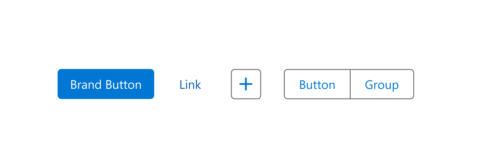
For example, we use blue for our buttons and links so our users associate the color with interactive elements. In the Salesforce experience, that color drives action. These decisions become learned behaviors within our design color system, and they support conscious and subconscious navigation. Ideally, users can understand meaning just by glancing at a UI object.
Intentionality also means having a clear perspective about design color usage. If you add color without associating it with a function, users might develop their own ideas about meaning. That can cause problems down the road when you make any color changes to the UI. The exception is if the color is used for expressive reasons like in an illustration.
2. Colors can indicate hierarchy at a glance
Use color contrast to make certain elements stand out. The higher an object’s contrast, the more attention it draws. Levels of contrast construct hierarchy within an experience.
Colors guide the user to key visual elements, but a screen with too many competing colors creates visual noise. Don’t over-use color where it isn’t necessary. We want users to focus on what’s important to most efficiently achieve their goals.

For example, the blue used for Salesforce buttons and links strongly contrasts with the majority of colors in our user experience. This hierarchy of contrast helps users locate an action easily. Within a “light” UI, it’s common to use lighter neutral colors for backgrounds. In this example, the background is primarily white and gray. These color choices enable the blue to stand out more, which elevates users’ visual navigation.
3. Colors represent your brand
A brand can represent its look, feel, and ethos through its colors. The logo might be the marquee expression, so additional colors have to complement it. The Salesforce brand uses one color within its logo – “cloud blue” – while some other brands use multiple colors.
There are varying levels of brand representation. Whether subtle or loud, design colors communicate a feeling to the user and cement that feeling to an association. For example, vibrant and bright colors convey energy and excitement, while subdued and dark colors can convey a cool, sleek aesthetic. Color choices are crucial decisions that influence how users experience a brand.
4. Solve for accessibility from the start
Good color choice considers accessibility at the beginning of the design phase. Salesforce color palettes adhere to accessibility guidelines and design patterns that meet those requirements automatically.
Our palettes operate as a whole, instead of a single solution. The Lightning Design System color system can support solutions beyond our Salesforce brands, and can support our customers’ own branding. The goal is to simplify color, so people have more time to focus on what they do best. Our accessible palettes take the guesswork out of accessible color design decisions.
Get to know the Salesforce color system
The Lightning Design System guidelines offers resources for how to pick the right colors for your brand and to meet accessibility guidelines.


