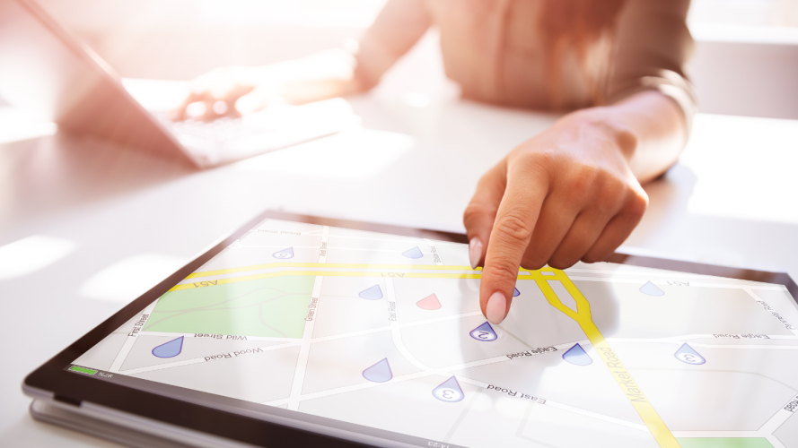


Imagine a service representative needs to repair a broken machine for a customer and that customer’s location is highlighted on a map. If the service rep has color blindness, they might not be able to distinguish which marker is highlighted. They’d have to hunt through menus and tables to find the information. This isn’t efficient. As a result, the extra time it takes to search for basic information adds up and can affect the quality of customer service.
But, a few changes to the design of the map to make it color blind-friendly can make all the difference.
In the following example, the map on the left shows a pink marker among a series of blue markers. The map on the right mimics how someone who has color blindness might see the same map: all one color. You can imagine how frustrating that might be.

We knew there were two things we could do to improve the accessibility for maps:
- Create a color blind-friendly color palette that anyone — especially someone with color blindness — can set up.
- Create markers that meet contrast requirements for better visibility.


What is color blindness?
Because of the name, there’s a misconception that a person with color blindness can see only in black and white. What color blindness, or color vision deficiency (CVD), actually means is that a person has a reduced ability to distinguish between colors compared to someone with typical color vision.
So how common is CVD? About 350 million people worldwide experience it, or 4 percent of the total population. It’s even more prevalent in men, where it occurs in about 1 in 12 men (about 8 percent). This means there’s potentially a large portion of our current Salesforce users who have color blindness. If we don’t make changes, we risk deterring new users from adopting our maps program.
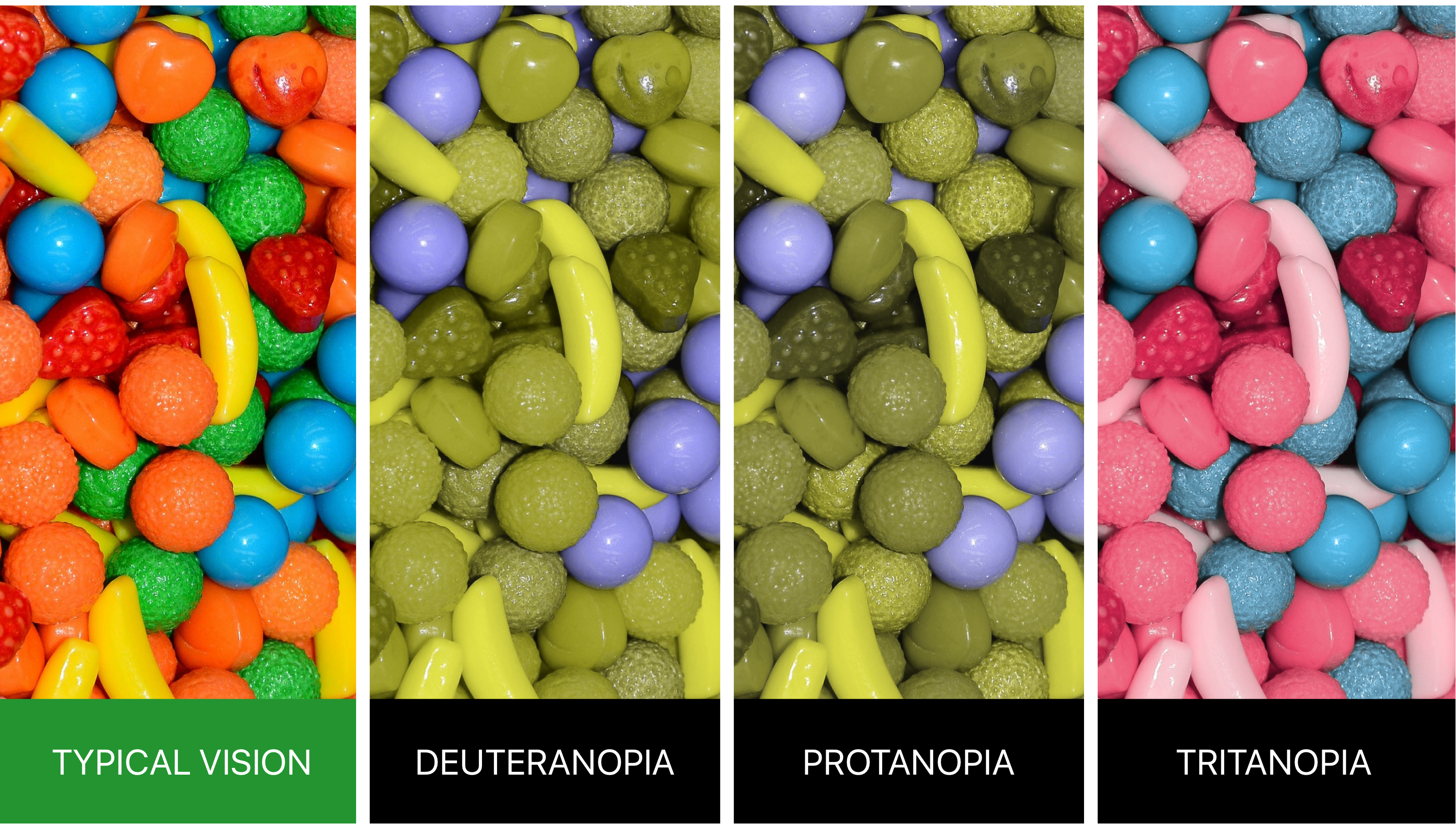
In the example images above of candy, we can get a sense of how different types of color blindness affect how a person perceives natural colors. The most common forms of color blindness are deutan (deuteranomaly and deuteranopia) and protan (protanomaly and protanopia), which are red/green types. The classic example for red/green color blindness is not being able to see a red apple in a tree full of green leaves. They all blend together. The third type, tritan (tritanomaly and tritanopia), is blue/yellow color blindness. The classic example is the blue water and yellow land on a map looking the same.
Starting with map markers
We started with redesigning the map markers knowing it would play a big role in how we addressed the color palette. Our old markers didn’t have clear borders, so people with low visual acuity may have had trouble distinguishing it from the map behind it.
The WCAG (Web Content Accessibility Guidelines) requires at least a 3.5:1 ratio between two elements. Because map markers might be a color that’s too close to the color of the map behind it, we decided that’s an area of opportunity. We broke convention from the industry standard for markers and added a double border, with a consistent white outline. With this design, the marker always has a minimum of 11:1 contrast ratio regardless of the background.
We also made it so the center dot changes from white to black based on the marker’s color to make sure there’s always a clear focal point. This feature was key to revising the color palette.

Developing the color palette
With the markers done, we started on developing a color blind-friendly palette. Building on previous work our design systems team did to create an accessible color palette, we selected 24 of the most appropriate colors. We removed all the colors that were too bright to be visible on the map background and too dark to easily distinguish.
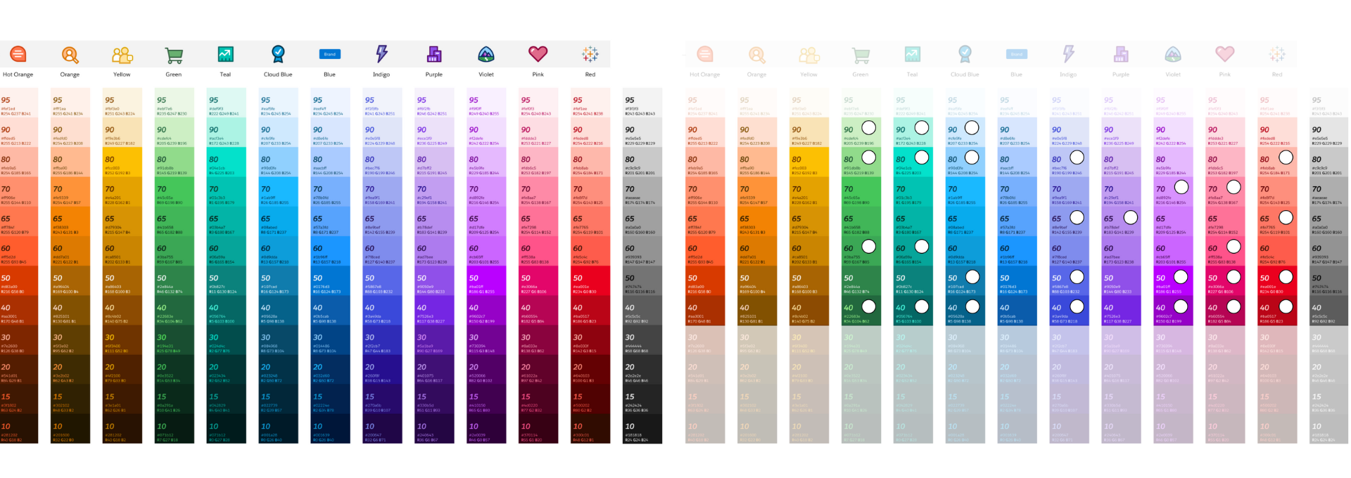
We used a color blindness simulator to check our accessibility (a11y) palette. Across the different types of color blindness, our initial palette resulted in too many duplicates. So, we continued to experiment. We wanted to balance giving users the largest color set possible that also could be distinguished by all color blindness types. We eventually landed on a set of 12 colors from the a11y palette, tweaked them to maximize the differentiation, and added black and white.
Testing the color blind-friendly palette
There’s only so much you can do using a color blindness simulator. While it was a great starting point, we needed to test the palette with real users.
There’s a large community of color blind people who actively communicate via the r/colorblind group on Reddit. We shared our palette and asked for feedback. The response was incredible. Folks told us what worked and what didn’t, and they gave suggestions for future changes. “No one ever thinks of designing for CVD. At best, there might be a toggle option with a smaller set of colors available.”
Practice Inclusive Design
Foster innovation with inclusive design principles. This module on inclusive design will get you started on how to recognize exclusion and ways to shift your thinking and practices. Discover how on Trailhead, the free online learning platform from Salesforce.

The next two rounds of feedback and iteration were helpful, but the new palettes were still confusing for people. There were always a few colors that appeared as duplicates. Then one Reddit user said: “We tend to just ignore things that are only differentiated by color. For example, when playing Ticket to Ride, I only use the tiny patterns on the cards and ignore the colors.”
That changed our approach entirely. For subsequent iterations, we added center dots from the markers into the color palette. The top row full of light colors would have a dark dot, and the bottom row of dark colors would have a white dot. According to the feedback we got, adding the dots reduced the number of indistinguishable colors from six to two. This illustrates just how precise the color differentiation had to be in this project.
We ran the simulation again and this was the result:
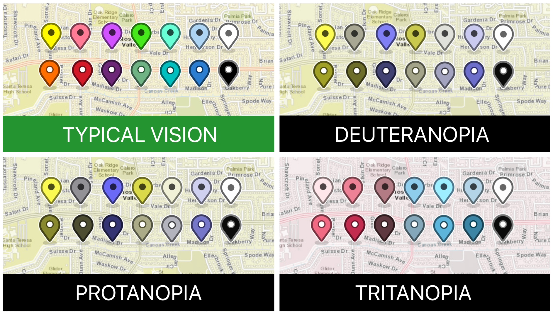
Our last round of testing involved 90 people and it had a 100 percent success rate. To put this project into perspective, there are 16,777,216 different colors in the RGB color wheel and we had to find 14 of those that would work. Those are challenging odds, but striving for accessibility and inclusion in the products and features we make always ought to be top of mind.