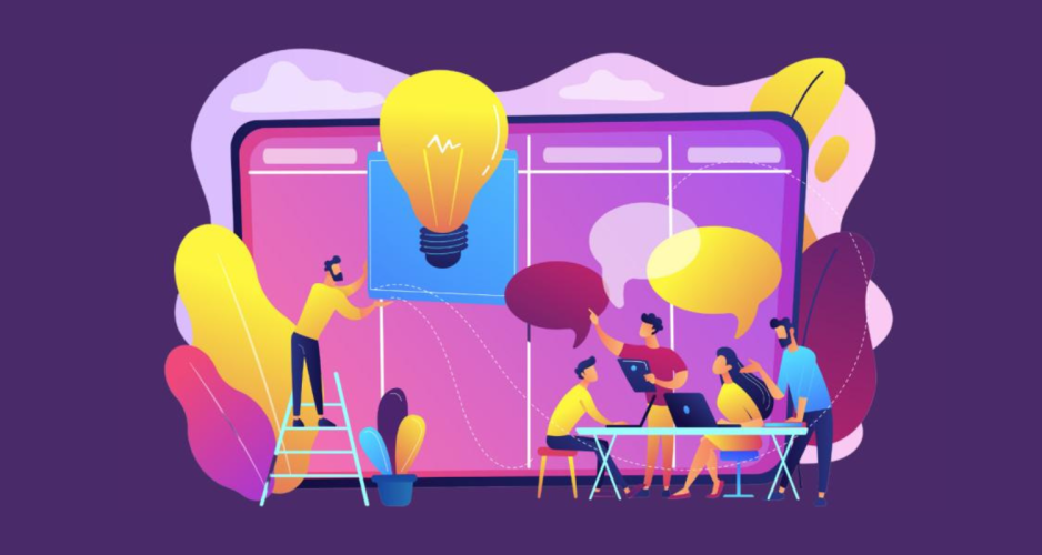
6 Inclusive Design Principles for Improving In-App Learning
Keep flexibility, clarity, and approachable language in mind when designing better user experiences.

How people learn is as individual as fingerprints. That makes it challenging to design in-app learning that considers all the different ways people absorb information. This is where inclusive design can help you build products that are easy to learn how to use. Better user experience means better product adoption – which is better for business.
Before we launched Salesforce Starter, we knew we needed to onboard users quickly. We also knew those users would have a range of learning needs. So we began a project where we worked with and learned from a group of people with disabilities to better understand potential mismatches between the needs of an individual and the design of our product.
What is inclusive design?
Inclusive design isn’t an outcome; it’s a process. That process involves partnering with a group of people who might experience the most exclusion when trying to use a product. It requires multiple engagements over time – not one-and-done. This is how you can learn about the barriers people encounter with your product and how they have to adapt – or quit using it. One nuance to note is that inclusive design isn’t the same as accessibility.
How to get started with inclusive design
Salesforce’s Research and Insights team worked with product designers and engineers, and with inclusive design leaders from the Office of Ethical and Humane Use. We recruited people with disabilities related to vision, memory, focus, or processing – including blindness, ADHD, short-term memory loss, dyslexia, and dyscalculia.


One example of inclusive design in action came through the opportunity to improve the “walkthrough” feature. Walkthroughs are a type of in-app guidance that familiarizes the user with the tools available in Salesforce. They’re often the first and only guide for people learning new skills or navigating an important business process.
If a walkthrough presents too much information at once, it can, for example, frustrate those who are neurodivergent and need to focus on one item at a time. It can also cause issues for those who use assistive technologies, such as screen readers.
This approach was helpful for designers to:
- Learn about participants’ challenges.
- Brainstorm and prototype solutions.
- Return to those same participants to learn whether those solutions actually worked.
It’s rare for designers to be able to learn directly from users, create a solution, and get meaningful feedback. Because of our inclusive design process, we were able to build a backdrop feature to spotlight the right information at the right time in the walkthrough. To showcase the highlighted information (what’s called a targeted prompt), it comes with a gray backdrop that masks the rest of the information.

The new version of this feature guides users along without overwhelming them. Filtering information is helpful for users who need clear signposts to focus their attention, like people with ADHD. It’s also generally a more pleasant experience for many users.
“Some people experience mismatches more acutely than others but most people have varying degrees of the same mismatch,” said Huong Le, a lead product designer at Salesforce and a pilot participant. “Solving these will be incredibly valuable for our users.”
How to make learning more inclusive
You can find the backdrop feature in Salesforce’s In-App Guidance today. We also arrived at the following six principles for designing inclusive learning pathways:
1. Design for flexibility and adaptability
Design for flexibility by providing content in multiple formats, because people have diverse needs in their learning experiences. The right learning path is highly contextual. Design with that tension in mind.
2. Provide multiple ways to learn
Provide content in multiple modalities to help users of different learning abilities be successful.
3. Build trust
Assure users they aren’t missing out on important content. Communicate how long the learning will take. Orient users so they know how to get back to their place should they happen to navigate away from the guidance. Give feedback that they’re doing a good job.
4. Support focus but maintain user agency
Many users need experiences that support focus. But they also need to maintain control and agency over what that experience looks like for them. Make sure the design offers options for users to determine what settings they prefer.
5. Provide clear information hierarchy
Clear information hierarchy is important for a range of users, including those who rely on screen readers or anyone who needs to scan information quickly. For example, be sure to tag your headings (H1, H2, H3, etc.) appropriately so the screen reader software understands how to navigate the text.
6. Use user-friendly language
Jargon and unfamiliar language can be off-putting and discourage users from exploring features that may be helpful to their learning experience. For example, be mindful about how branded language is used in your products. If someone is new to your company or product, they may not immediately understand specific references.
Small changes can ripple far
While the project focused on a specific product feature, the insights from the research have spread to other teams. One participant summed up the experience this way: “Involving users from different backgrounds and abilities earlier in the design process benefits all users. Sometimes there’s a conflict and tension in the insights, but it’s a constraint that will lead to innovation.”
Try Salesforce Starter for free
Get started with CRM and see results from day one with Starter Suite — the all-in-one suite of the marketing, sales, service, and commerce tools you need to succeed. Get the power of the world’s #1 CRM in a simplified, easy-to-use suite built for growing businesses.